Two funds merge
Project: Team Super rebranding
Client: Team Super Funds
Role: Visual Design Lead
Following the merger of two superannuation funds, the challenge was to create a unified brand that built trust, clarity, and a sense of strength for members during a period of change.
We developed a bold and grounded identity for Team Super, positioning the brand around strength, industry expertise, and reliability, while ensuring it resonated with its core audience across transport, energy, and mining sectors.
As Design Lead, I led the creation of the brand identity and system, delivering a comprehensive playbook and rolling out the brand across OOH, digital, and web.
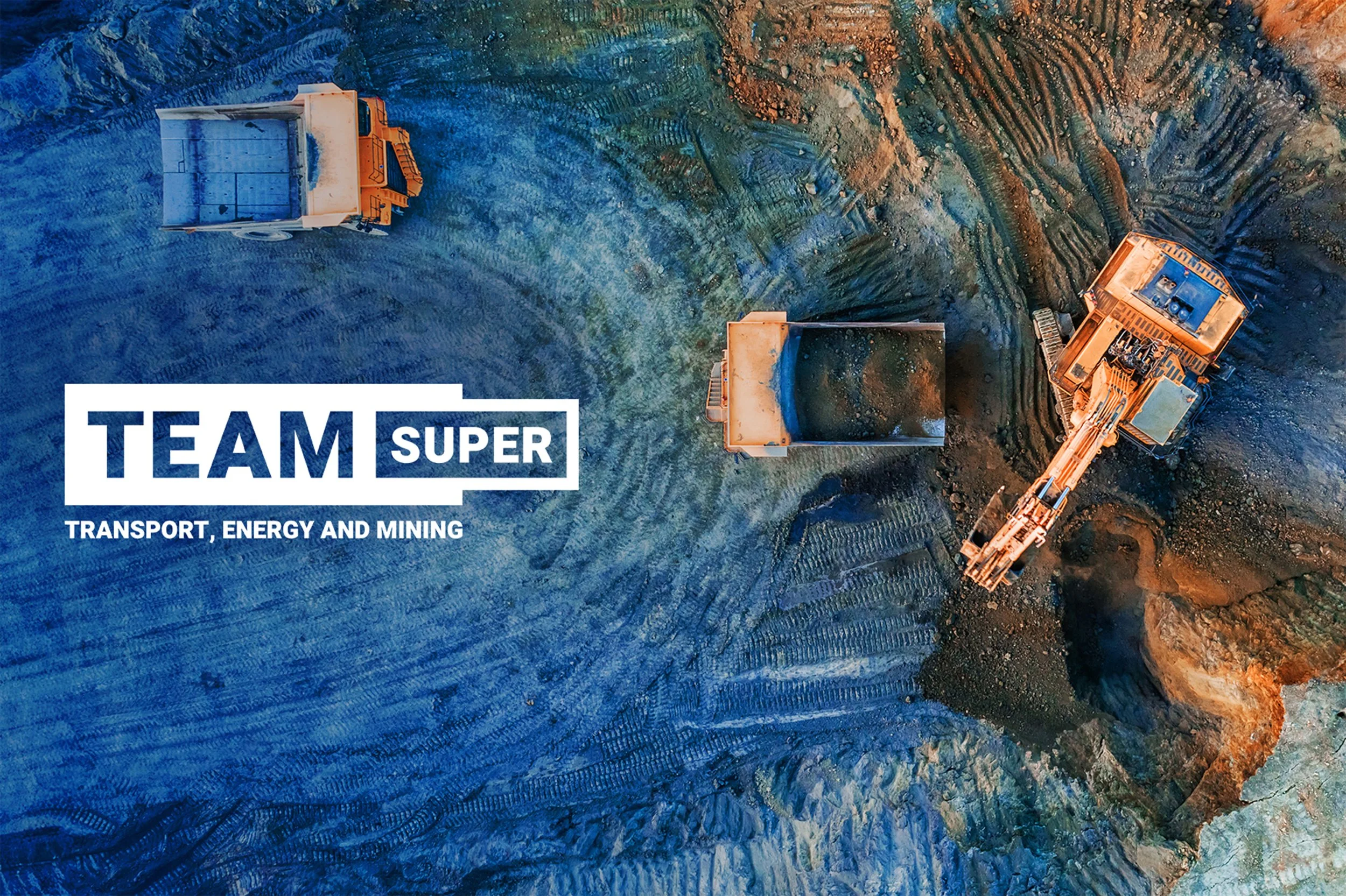
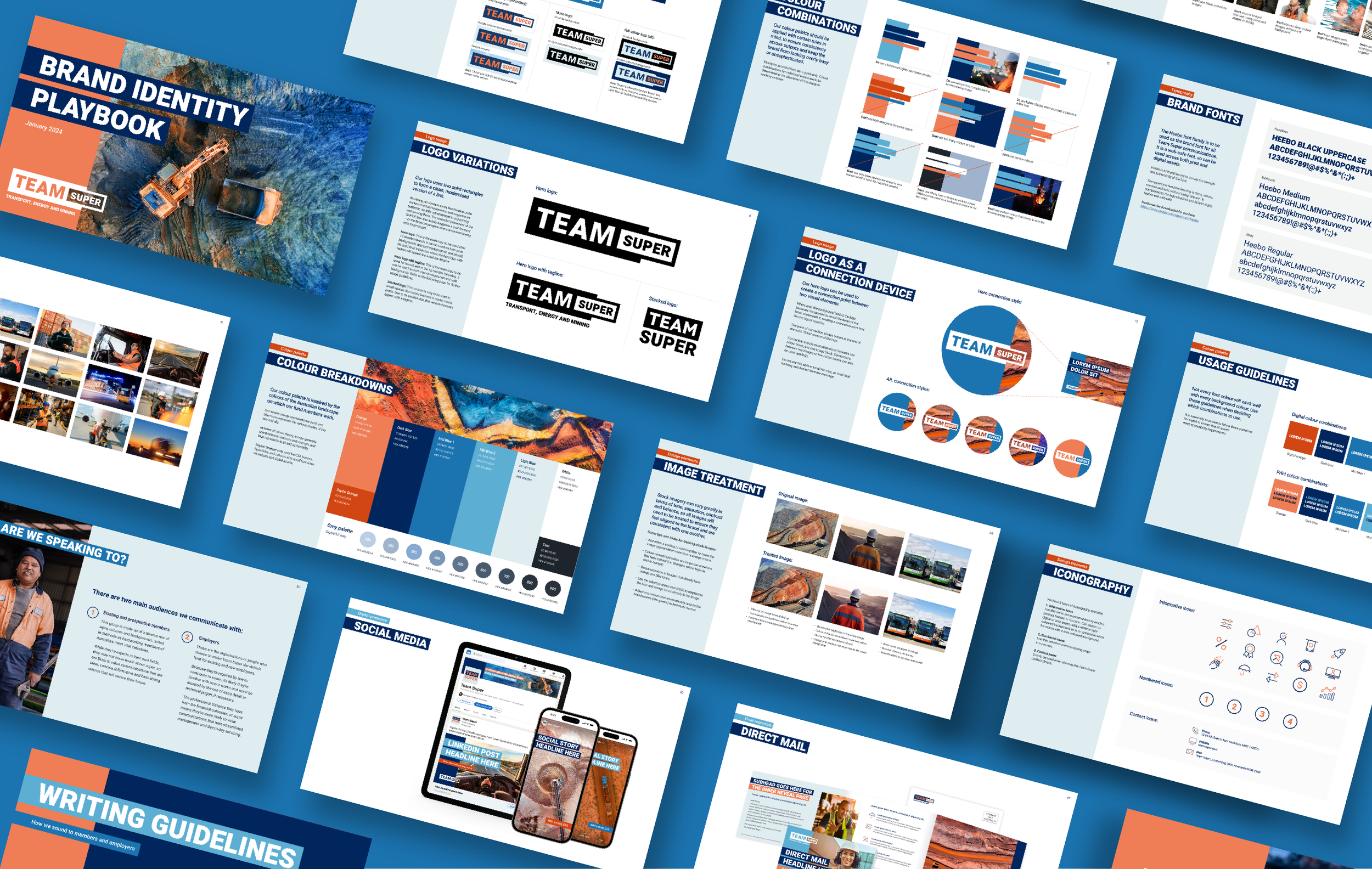
Brand identity system
The identity system was designed to be simple, confident, and highly adaptable. A strong typographic approach, combined with a bold colour palette and structured layouts, created a cohesive visual language that could scale across all touchpoints.
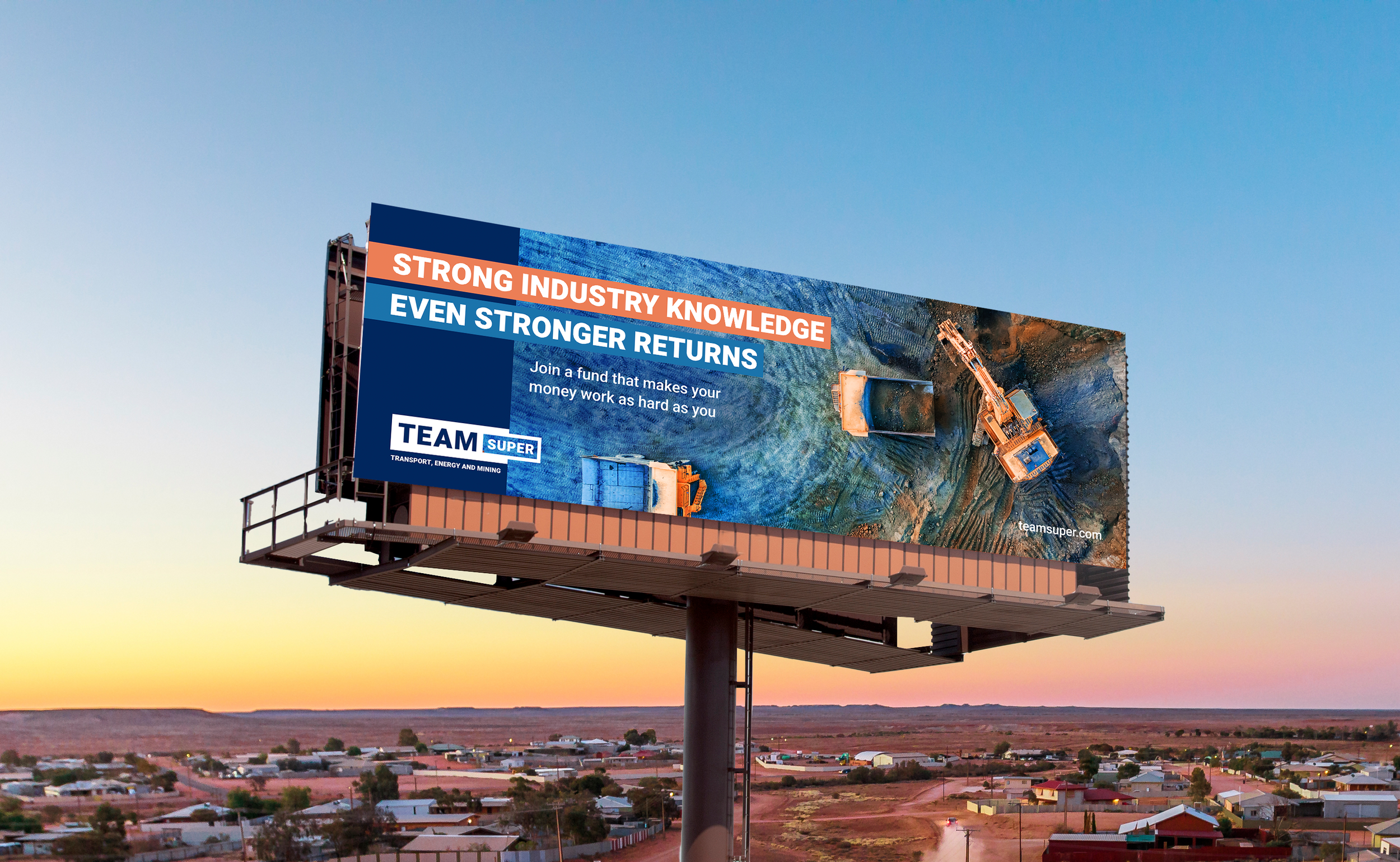
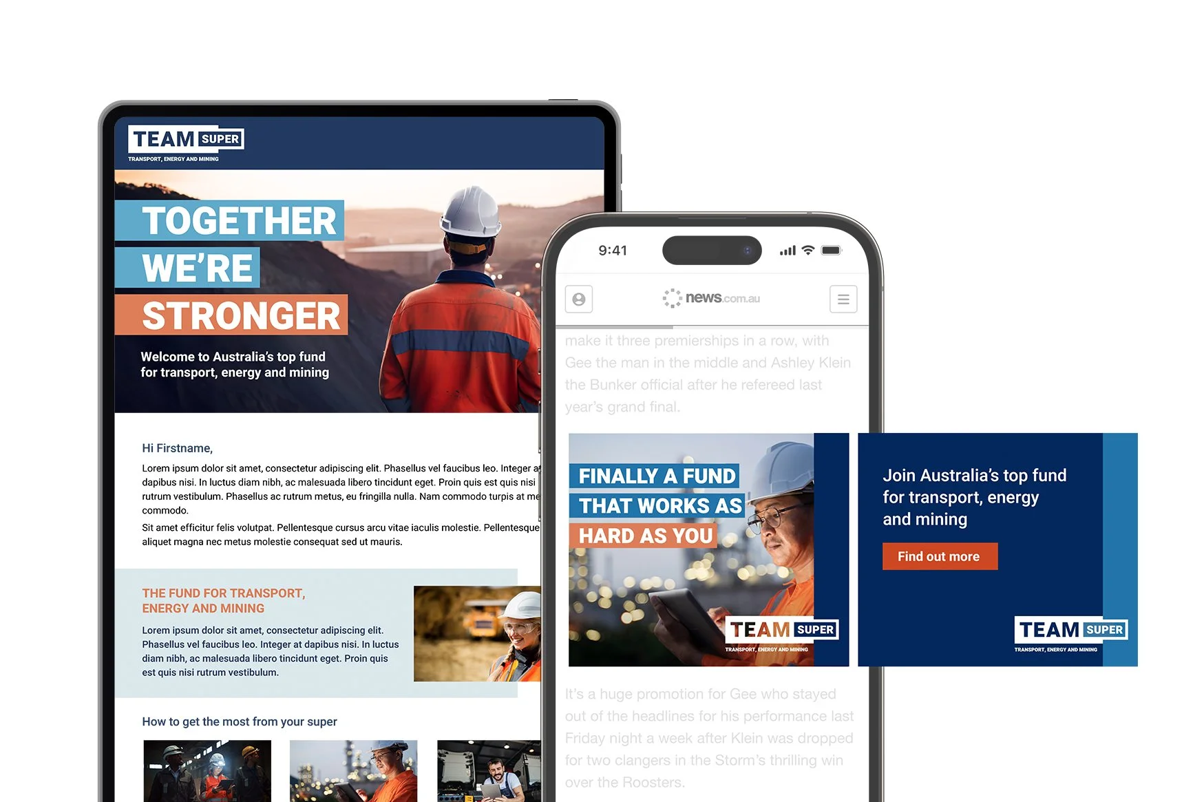
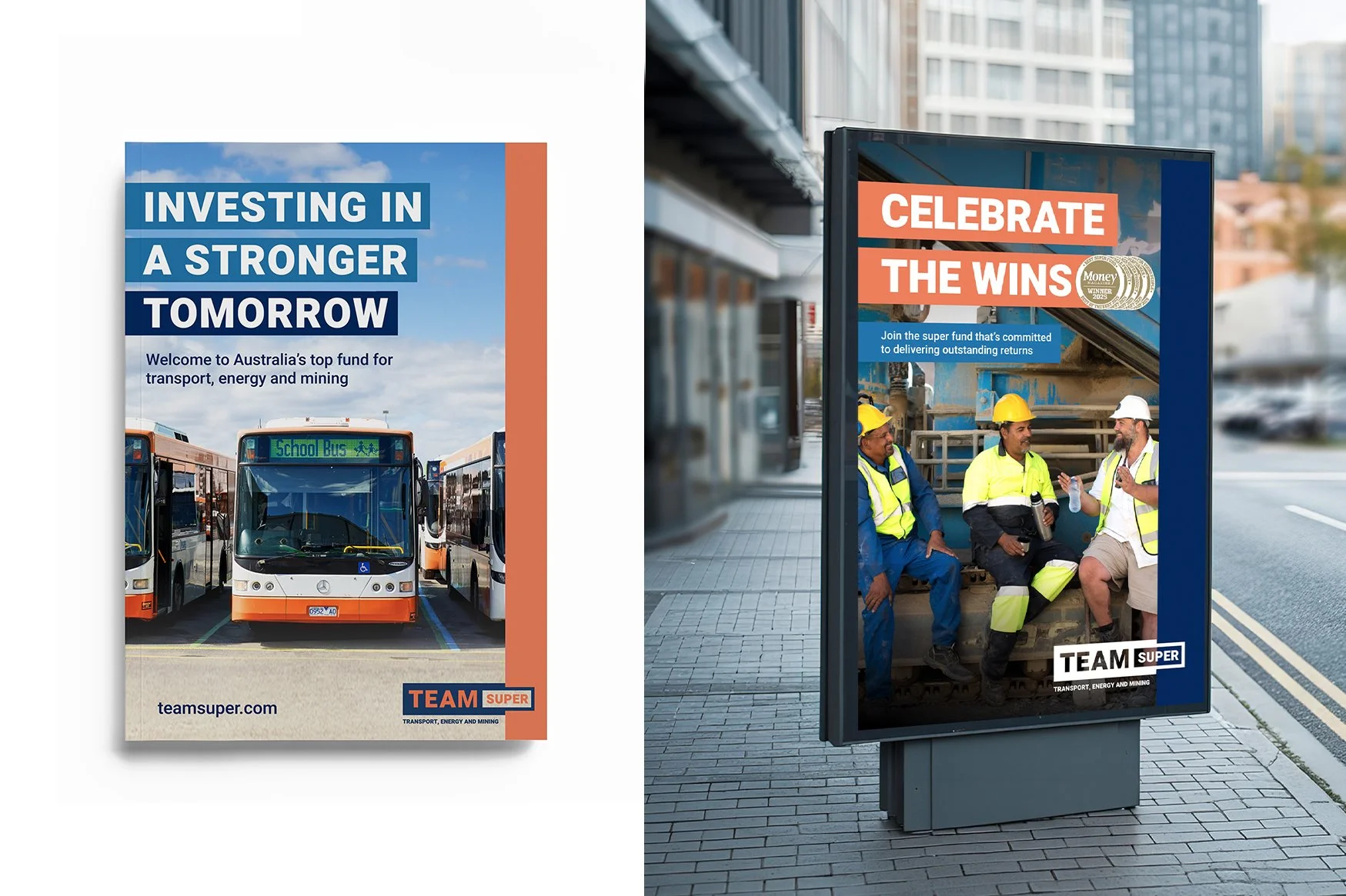
Application
The brand was rolled out across multiple channels, including OOH, digital campaigns, and member communications, ensuring a consistent and recognisable presence across all customer touchpoints.
Design guidelines
A comprehensive brand playbook was developed to ensure consistent application across teams.. It defined best practices for typography, colour, layout, imagery, and tone of voice with examples of application – creating a scalable system for ongoing use.
Website design
In collaboration with the UX team, I contributed to the design of the Team Super website, helping translate the brand into a digital experience through a consistent design system, imagery, and iconography.